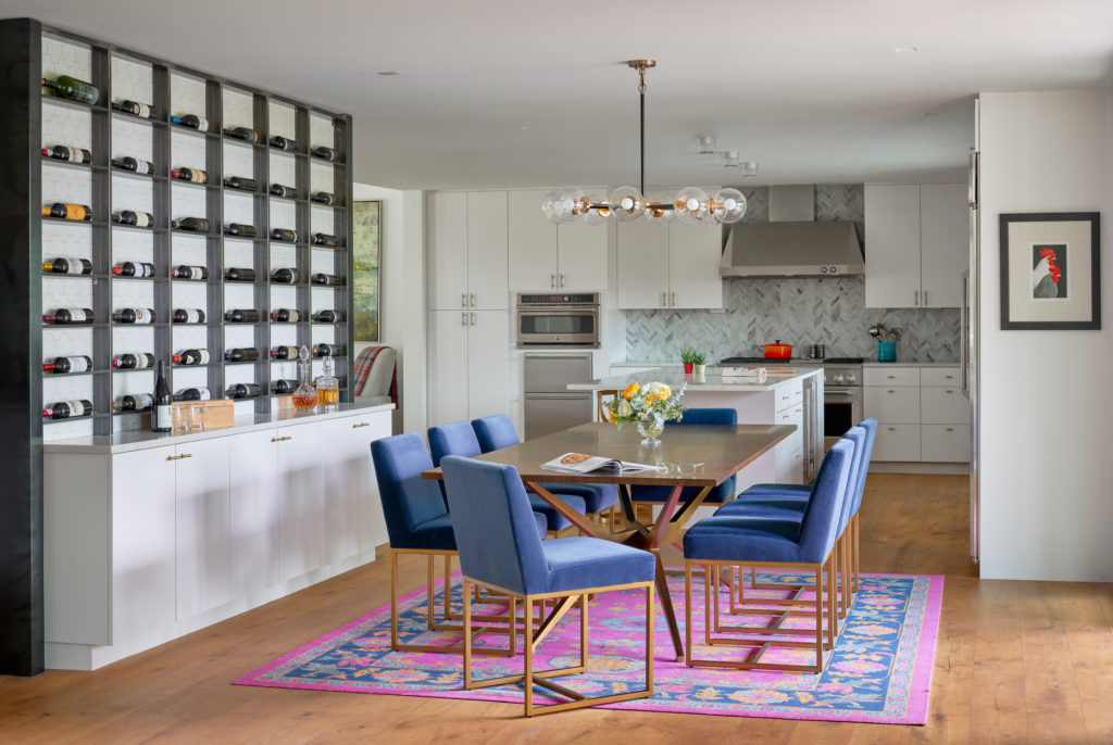
Austin architect Erica Flannery transforms a dated ranch home into a modern Hill Country oasis.
By Kathryn Stouffer, Before photos courtesy of Tim Brown Architecture, After photos by Leonid Furmansky
When Erica Flannery of Tim Brown Architecture was approached to breathe new life into a 1970s ranch home tucked in the hills of South Austin, she accepted the challenge. The clients, having renovated several houses before, were not naive to the process and knew to contact Flannery, a master of her craft.
Flannery moved to Austin six years ago, fresh-eyed from architecture school, and immediately delved into the world of residential design with Tim Brown Architecture. The cohort of four architects at Tim Brown can be found working throughout Austin, with the occasional project outside the Lone Star State.
As for the latest project in Flannery’s portfolio, a once unassuming home underwent a massive transformation from a dark and dated 1970s build
to an open and light-filled structure, with Flannery preserving the ideal amount of midcentury-modern elements, which are seamlessly blended with contemporary finishes.

Before
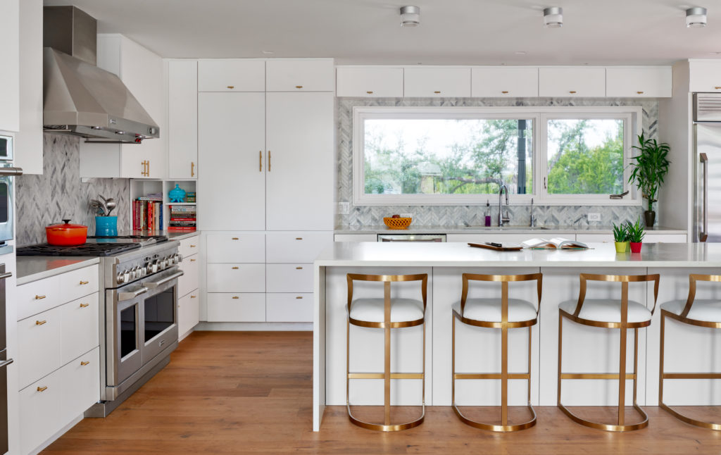
After
Although the home was stripped to the studs in order to create a blank canvas for the clients and Flannery to dream, Flannery worked with select elements of the original structure to maintain its character and history, including the split-level floor plan.
“The core of the house is similar to what it was when we came on board. The raised entry is really unique and something we’ve never done before, so we wanted to maintain that in the remodel,” Flannery notes. “We wanted to revamp the house, bringing in the flair of the new age of midcentury modern.”

Before
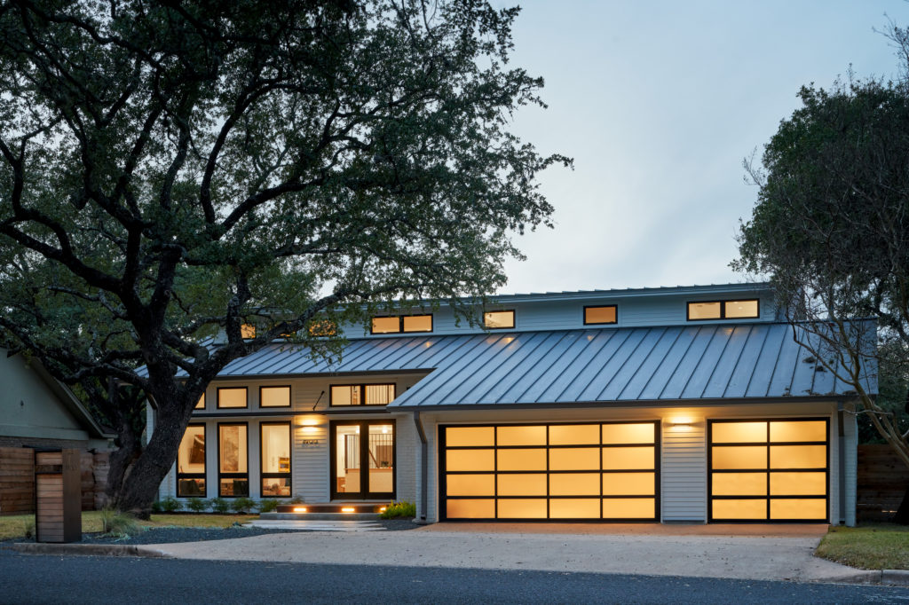
After
When asked to describe the home now, along with her favorite additions, Flannery says she is excited about several of the key exterior features.
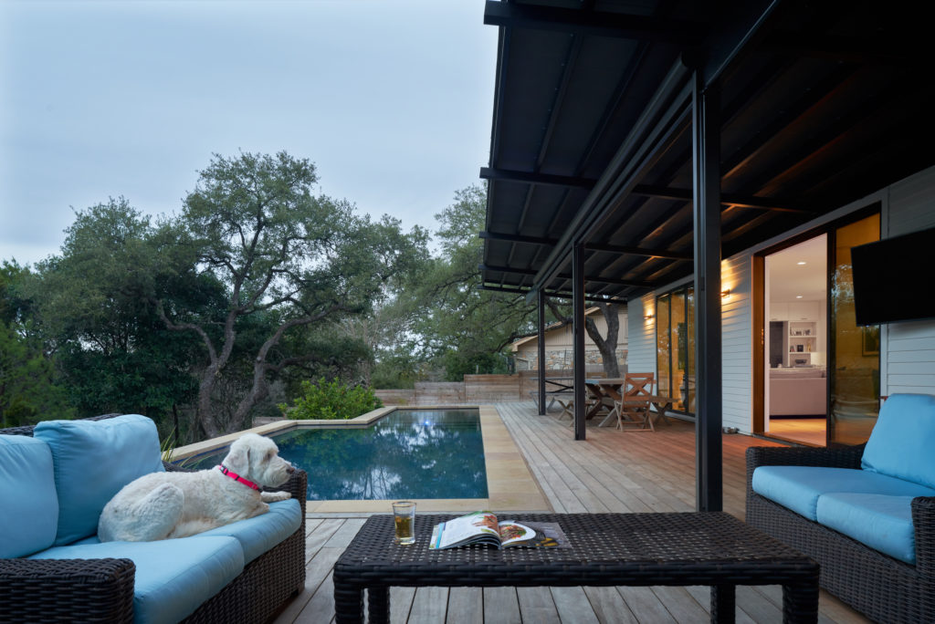
“There is a huge indoor-outdoor connection with the new pool deck, fitted with a half-butterfly roof sloping up from the back of the house, which is a cool modern element. We also included industrial-feeling steel awnings in the front of the house, which make it a standout from street view,” she says.
Flannery also collaborated with the homeowners to outfit the interiors. Her favorite feature is the classic Ann Sacks tile incorporated throughout.
“This house has a Mad Men vibe, which I love,” Flannery shares. “My clients have great taste and bring vibrant elements into their living spaces, which add life into the new layout and neutral finishes.”
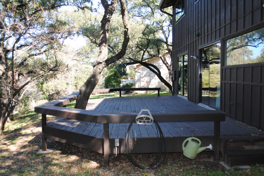
Before
After
INNOVATE TO RENNOVATE
Erica Flannery share her top insights for home-renovation projects and what changes make a lasting impact.
PHASE-ONE DIYERS
For those on a tight budget or just dipping their toes into the world of home remodeling, Flannery shares her go-to fixes.
“If you can’t redo your windows, making your walls white will drastically improve the brightness of your space,” Flannery says.
While certain paint swatches phase in and out of style, white is a timeless option when opting to create the illusion of more light.
When it comes to revamping a home, in general, Flannery recommends focusing on the low-hanging fruit you can tackle yourself.
“The little things and projects with easier aspects can make a big difference when you add them up,” she says.
If you want to take it up a notch, Flannery touts the power of opening up living spaces, as well as integrating landscaping outside for enhanced curb appeal.
NEXT LEVEL
For those plotting additions, wall teardowns and the like, Flannery suggests thinking big changes through before taking the leap.
“It can be more expensive to renovate your home versus completely starting over,” she says, “so focus on the key elements you want to change before launching into a complete overhaul.”
If you’re brave enough to face a renovation and enlist experts such as Flannery, she recommends focusing on the overall flow of the house first.
“If there’s a way to open it up, start there,” she proposes. “If you’re trying to decide which room to renovate, I usually point to your main living spaces, as these usually make the most impact in your daily life.”

